*Reformat and filter a time series DataFrame based on participant ID, array index, and date range.
Args:
df (pd.DataFrame): The DataFrame to filter.
participant_id (int): The participant ID to filter by.
array_index (int): The array index to filter by.
time_range: The date range to filter by. Can be a tuple of two dates / times or two strings.
x_start (str): The name of the column containing the start time.
x_end (str): The name of the column containing the end time.
unique (bool): Whether to remove duplicate rows.
*Initialize a TimeSeriesFigure instance. This class is used to create and manage a figure with multiple axes for time series data.
Args:
figsize (tuple): Size of the figure (width, height) in inches.
padding (float): The amount of padding to add between axes as a fraction of the figure height.*
*Get a color map for a specific column in the data.
Args:
data (pd.DataFrame): The data to get the color map from.
hue (str): The column name to use for the color map.
palette (str): The name of the colormap to use.
*Get the period of time between the start and end events.
Args:
events_filtered (pd.DataFrame): The events DataFrame.
period_start (str): The label of the start event.
period_end (str): The label of the end event.
period_name (str): The label to assign to the period.
col (str): The column name for the event labels. Default is 'event'.
first_start (bool): If True, get the first start event. Default is True.
first_end (bool): If True, get the first end event. Default is True.
include_start (bool): If True, include the start event in the period. Default is True.
include_end (bool): If True, include the end event in the period. Default is True.
x_start (str): The column name for the start time of the event. Default is 'collection_timestamp'.
x_end (str): The column name for the end time of the event. Default is 'event_end'.
Returns:
pd.DataFrame: The period of events in the same format as the input DataFrame.*
events (pd.DataFrame): The timeseries / events dataframe.
x_start (str): The column name for the start time of the event.
x_end (str): The column name for the end time of the event.
hue (str): The column name for the color of the event.
label (str): The column name for the label of the event.
participant_id (int): The participant ID to filter events by.
array_index (int): The array index to filter events by.
time_range (Iterable[str]): The time range to filter events by.
y_include (Iterable[str]): The list of values to include in the plot.
y_exclude (Iterable[str]): The list of values to exclude from the plot.
add_columns (Iterable[str]): Additional columns to include in the plot.
palette (str): The name of the colormap to use for coloring events.
Returns:
Tuple[pd.DataFrame, pd.DataFrame]: The filtered events dataframe and the color map.*
*Plot events as filled regions on a time series plot.
Args:
events (pd.DataFrame): The events dataframe.
x_start (str): The column name for the start time of the event.
x_end (str): The column name for the end time of the event.
hue (str): The column name for the color of the event.
label (str): The column name for the label of the event.
participant_id (int): The participant ID to filter events by.
array_index (int): The array index to filter events by.
time_range (Iterable[str]): The time range to filter events by.
y_include (Iterable[str]): The list of values to include in the plot.
y_exclude (Iterable[str]): The list of values to exclude from the plot.
legend (bool): Whether to show the legend.
palette (str): The name of the palette to use for coloring events.
alpha (float): The transparency of the filled regions.
ax (plt.Axes): The axis to plot on. If None, a new figure is created.
figsize (Tuple[float, float]): The size of the figure (width, height) in inches.*
events (pd.DataFrame): The events dataframe.
x_start (str): The column name for the start time of the event.
x_end (str): The column name for the end time of the event.
y (str): The column name for the y-axis values.
hue (str): The column name for the color of the event.
participant_id (int): The participant ID to filter events by.
array_index (int): The array index to filter events by.
time_range (Tuple[str, str]): The time range to filter events by.
y_include (Iterable[str]): The list of values to include in the plot.
y_exclude (Iterable[str]): The list of values to exclude from the plot.
legend (bool): Whether to show the legend.
palette (str): The name of the colormap to use for coloring events.
alpha (float): The transparency of the bars. Default is 0.7.
ax (plt.Axes): The axis to plot on. If None, a new figure is created.
figsize (Tuple[float, float]): The size of the figure (width, height) in inches.*
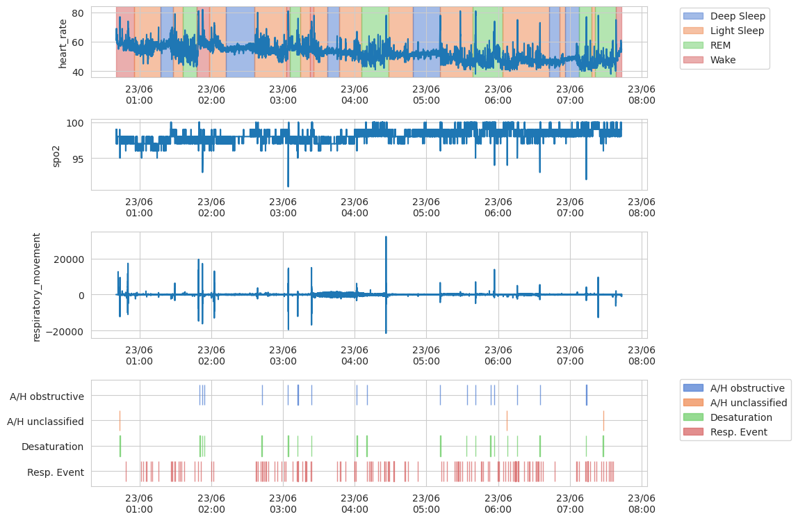
How to plot time series
The class TimeSeriesFigure provides a user-friendly interface for plotting multiple channels of time series data.
First, we will load time series DFs from the sleep monitoring dataset. The data includes sleep events, and sensor channels for heart rate, respiratory movement, and oxygen saturation.
/home/ec2-user/projects/pheno-utils/pheno_utils/pheno_loader.py:610: UserWarning: No date field found
  warnings.warn(f'No date field found')
Any plotting function that accepts an ax argument can be used with TimeSeriesFigure. The pheno-utils package includes a number of functions that are useful for plotting time series data, such as plot_events_bars and plot_events_fill, however standard seaborn plotting functions (and others) can also be used.
sns.set_style('whitegrid')g = TimeSeriesFigure()channels_df = format_timeseries(channels_df).set_index('collection_timestamp')g.plot(sns.lineplot, channels_df, x='collection_timestamp', y='heart_rate', name='heart_rate') # Named axis 'heart_rate'# You can also use the `sharex` argument to share the x-axis between plots# Named axes, such as 'heart_rate', can be referred to by nameg.plot(sns.lineplot, channels_df, x='collection_timestamp', y='spo2', sharex='heart_rate')# You can increase the relative height of the plot by passing a `height` argumentg.plot(sns.lineplot, channels_df, x='collection_timestamp', y='respiratory_movement', sharex='heart_rate', height=1.5)# You may add a plot to an existing axes by passing an `ax` argument to the plotting function# Named axes, such as 'heart_rate', can be referred to by namestage_events = ['Wake', 'Light Sleep', 'Deep Sleep', 'REM'] # Include only sleep stage eventsg.plot(plot_events_fill, events_df, hue='event', y_include=stage_events, ax='heart_rate')apnea_events = ['Resp. Event', 'Desaturation', 'A/H obstructive', 'A/H central', 'A/H unclassified']g.plot(plot_events_bars, events_df, hue='event', y_include=apnea_events, height=1.5)# Control functions to conveniently modify all axesg.set_periodic_ticks('1h')g.set_axis_padding(0.05)g.set_axis_properties(xlabel='')